Artefex has so many panels! I want to try them all!

    September 2023 I took on the challenge of painting 30 paintings in 30 days! For a slow, detailed painter like myself, this seemed like a pretty monumental task…which is exactly why I did it! This stretched me in so many ways. 

      Teaming up with me for this adventure was Artefex, a small California company that makes beautiful artists’ panels in a variety of surfaces. Their Aluminum Composite Material (ACM) panels come in so many options, it can be a little mind boggling. So, let me break down what I found for you. 

Allinpanel- Great for building up texture easily

First off, let’s talk about the Allinpanel. This panel consists of linen in a variety of weaves (medium, fine, and extra fine) mounted on a rigid, archival ACM panel and comes primed with your choice of acrylic priming or oil priming. 

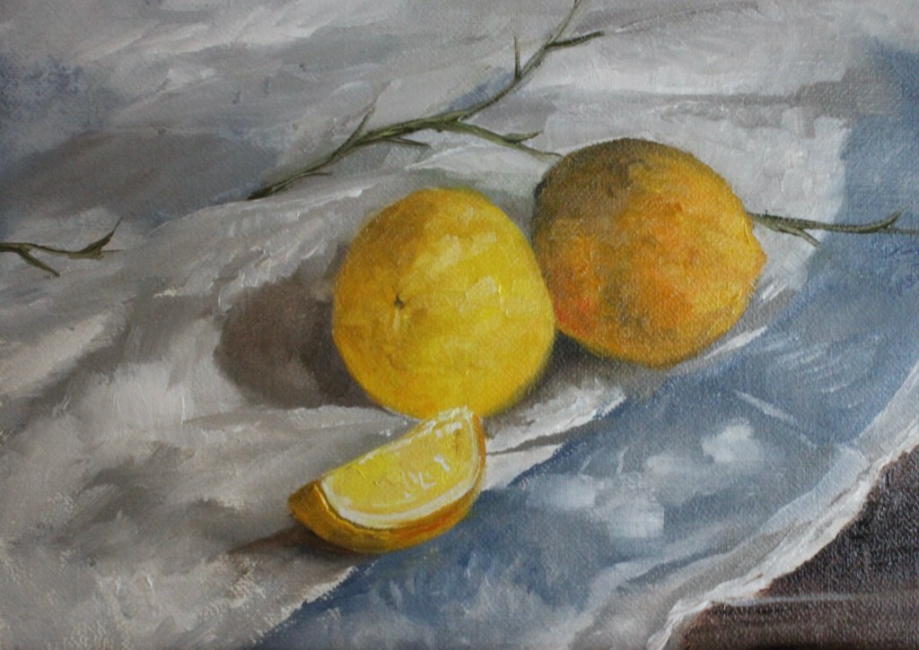
This first painting of this 30 day series was on a medium weave, oil primed Allinpanel. I’ll be honest, at first I wasn’t so sure about it. I usually go for a smoother texture. However, it turned out to be exactly the panel I needed. The medium weave had considerable drag, but that made it the perfect panel for a heavily textured, alla prima painting. I was able to lay down thick tiles of paint without pulling up previous layers. By some magic, however, this texture somehow didn’t get in the way for areas of the painting where I wanted a smoother effect. This is a great panel if you want to build up thick layers of paint quickly and add a great deal of texture, especially if your style is a little looser. 

If you still want some tooth, but you like a slightly smoother surface, the Allinpanel in fine or extra fine might be a better option for you. There is still some considerable brush drag on the initial layer, but not as much as with the medium weave. As with the medium weave, the linen texture made it easy to apply paint and build up layers, however, because the weave is finer, you have much more control over the tiny details. These are beautiful panels for both direct and indirect painting styles. 

As I mentioned, the Allinpanel is available in both oil primed and acrylic primed. If you’re an acrylic painter, you’re strictly limited to the acrylic ground. However, if you’re an oil painter, you can take your pick. The panels perform very similarly, but I found the acrylic priming to be a little more absorbent. 

Alcot- Really unique surface. Great for going back and forth between adding paint and taking off paint. Good for working in indirect layers

Speaking of acrylic, Artefex has another great acrylic primed option. The Alcot panel is cotton polyester mounted to ACM panel. Like the Allinpanel, it is available in medium, fine, and extra fine weave. However, as opposed to the Allinpanel’s irregular, linen weave, the Alcot panel has a uniform weave. That’s really where the similarities end. This is a really unique panel. To be honest, it takes a little getting used to.

This trompe l’oeil painting of a feather hanging from a painted cedar plank was painted on a fine-weave Alcot panel. I fought with laying down paint and building up texture without picking up wet paint from the previous layer.

The next painting I did on an Alcot panel, “Beckoning,” started out the same way and I ended up scraping off a fair bit of my paint in frustration.. THAT’S where it got fun! The areas where I scraped the paint maintained the really beautiful, glowing paint layer that I was able to build on a little more easily. I realized that in expecting it to behave like an Allinpanel, I risked missing out on what it actually is- a panel that’s somehow both textured and slick at the same time. Once I got the grasp of that I really started loving this panel! This is a great panel if you like to play with adding and then scraping paint; building up and taking off texture in different areas. I personally like the fine and extra fine weaves the best, but if you like your texture to show, the medium is a great one. Note: After I completed this 30 day project, Artefex released an oil primed option. I cannot wait to try it!!

This painting, was done on Alcot panel that already had a dried layer of paint on the surface. I found it easier to build up layers with that initial paint layer down.

Oleopanel- Oil painters only. My favorite for indirect painting and minute details, but also great for alla primas

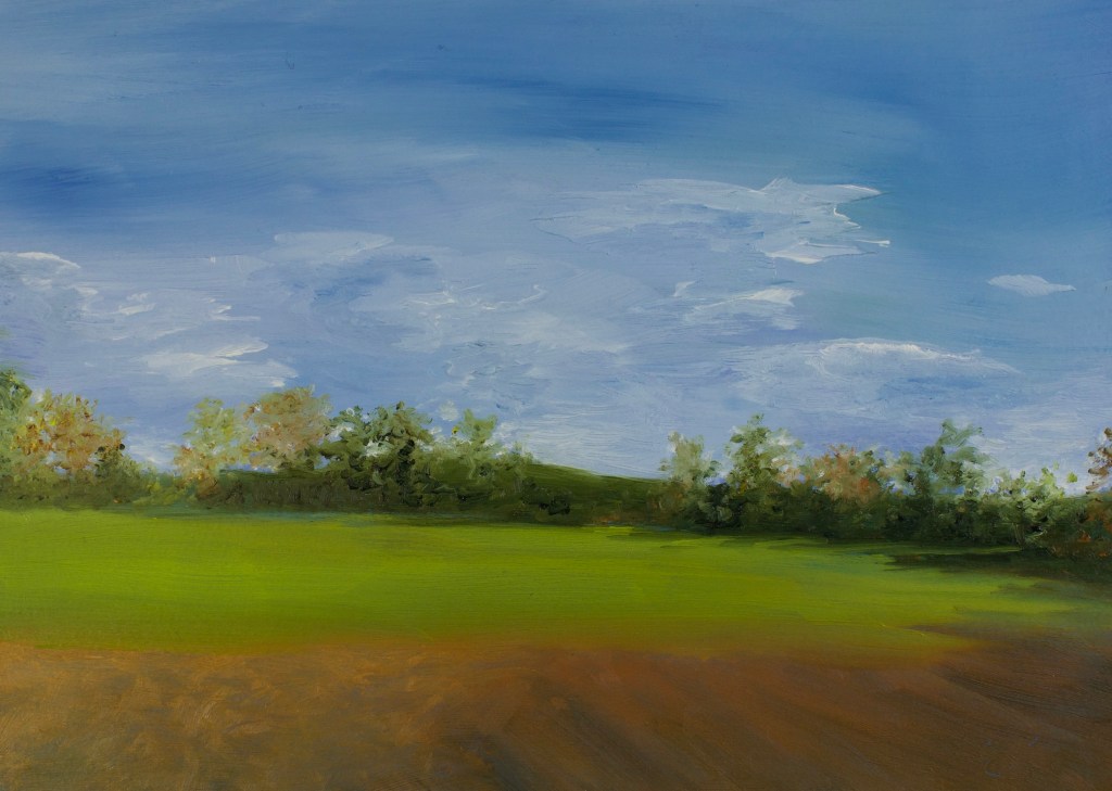
While we’re on the subject of oil priming, Artefex’s next option for oil painters is the Oleopanel. Unlike the Allinpanel and Alcot panel, which have linen or canvas adhered to the panel, the Oleopanel has a lead oil priming applied directly to the ACM panel. It’s available in a slightly bumpy, eggshell texture, and a smooth texture. These are absolutely beautiful panels, especially if you like a smooth surface. The paint goes on like a dream and feels SO smooth, with enough tooth to keep it from slipping and sliding off the surface of the panel. Even with all this smoothness I was able to add layers and build up texture with a direct painting method, though not as easily as with the Allinpanel. The slight texture of the eggshell Oleopanel was easier for alla prima painting than the smooth, however both the smooth and the eggshell handled thick paint application more easily than I expected from such a smooth surface. Though they can be used for direct painting, I think the Oleopanels are best suited for a more indirect painting style. 
Tempanel- Very versatile and unique

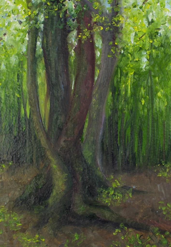
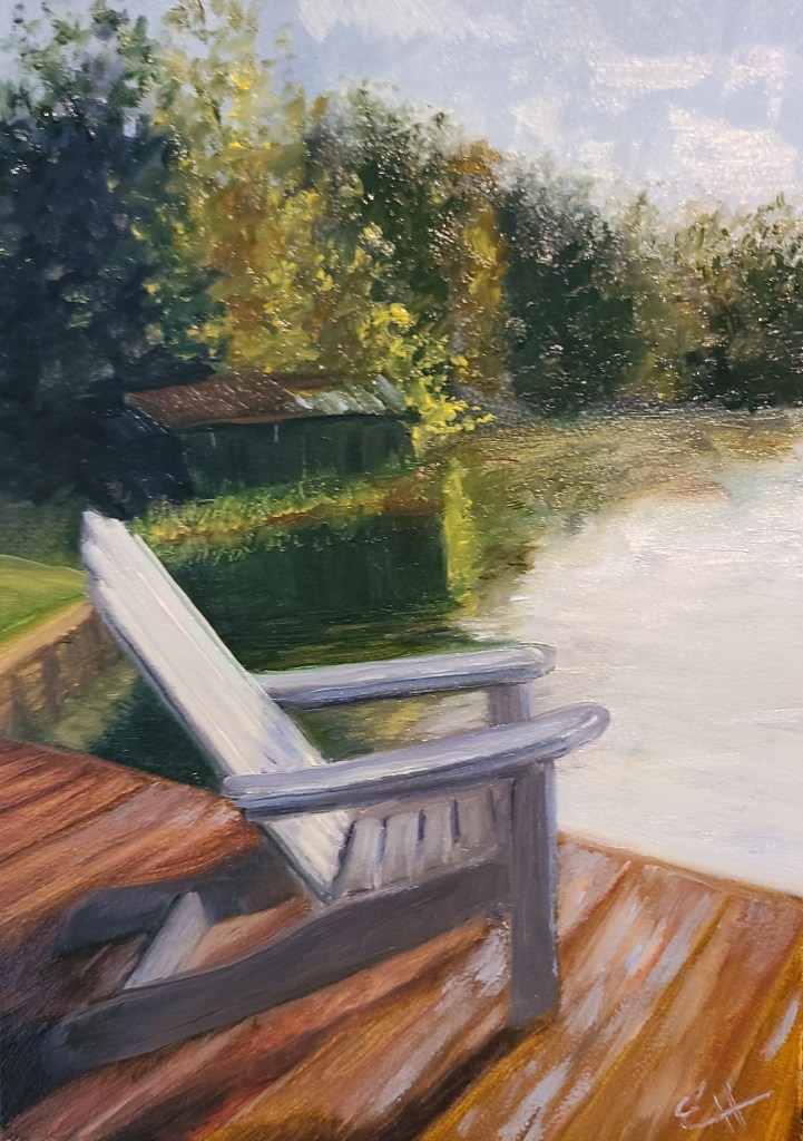
Artefex Tempanel is another truly unique panel. Originally intended for tempera painting, this absorbently primed panel can handle a huge variety of mediums. The priming is a little hard to describe. Just to play with all the different options, I used this panel for a mixed-medium piece, trying out pen and ink, watercolor, and oil paint. First off, I loved drawing on it. The pen handled the way it would on really nice paper. I loved the way the watercolor handled as well, but it wasn’t quite what I expected. It sort of sits on top of the surface, sinking in slowly. If I had expected it to respond the way it would on paper, I would have been flustered, however, I was just playing and experimenting and I loved the outcome. While the surface wasn’t as absorbent as I expected for the watercolor, it was more absorbent than I’m used to when working with oil. I actually ordered more of these panels to play with some more because they really are so different and interesting. In addition to the mediums I tried, you can also use acrylic paint and dry mediums.
Chartapanel- Drawing and watercolor

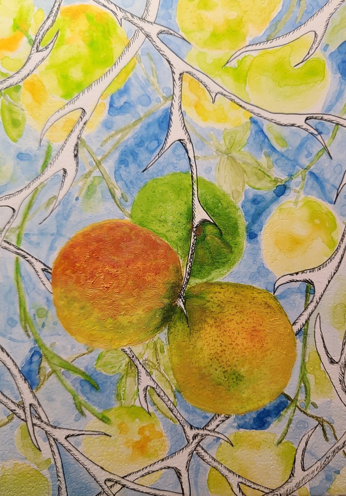
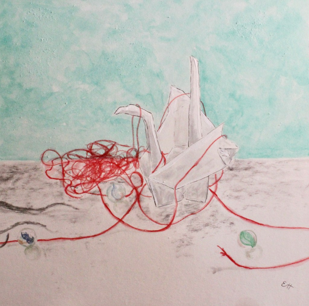
Speaking of dry mediums, Artefex has other panels for that, too! The Chartapanel! These ACM panels are mounted with either Arches Coldpress Watercolor paper, or Strathmore 400 drawing paper. To try out these two different papers side by side, I painted a diptych. The Arches watercolor paper has an absorbent texture, making for lovely soft edges. Though intended for watercolor, it can also be used for dry medium (such as the charcoal shown here). The Strathmore drawing paper has a smooth, crisp finish, making for sharp lines and clean edges. Though intended for drawing, it can also handle watercolor (again, as seen here). I love the concept of mounting watercolor and drawing paper to these archival panels, because it solves so many problems! Being on paper, watercolor paintings are automatically more delicate and harder to preserve and restore. These panels are impervious to the effects of time, so using them to support this delicate paper makes loads of sense. Plus, no matter how much water I used the paper didn’t wrinkle, curl up, or separate from the panel at any point. Brilliant!
Copper- Unprimed, very archival, very slick. Great for thin layers, indirect painting

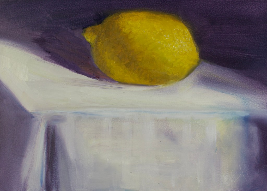
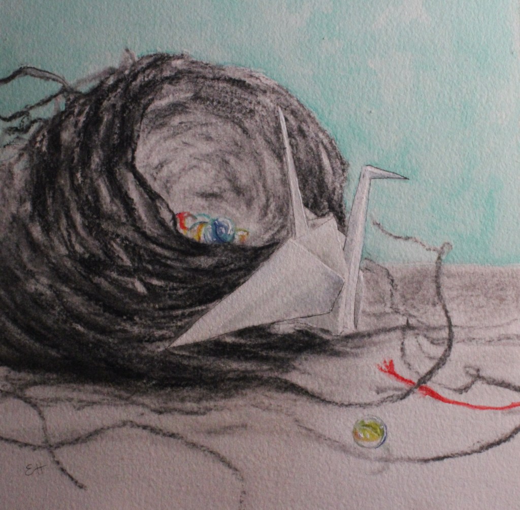
Last, but not least, the copper panel. Aaah, I love copper! That glow is so beautiful! Because it’s so beautiful, many artists choose to leave a fair bit of it showing. However, I personally like to paint thinly over it- just enough to knock off the shine a bit while still letting it glow through. I have seen artists paint in an alla prima style on copper, but it’s slick…SO slick! It’s hard to get the paint to adhere and the first layer will likely be streaky. Because of this, I like to work in thin layers, letting each layer dry before moving onto the next, but that’s just me.

So there you have it! The Artefex panels! I hope this guide makes it a little easier for you to choose. I really have nothing bad to say about the panels or this company. Feel free to reach out to me with any questions, or talk directly to them! They’re so responsive and knowledgeable. You can find them at https://www.artefex.biz/

I originally wrote about my entire painting journey in my newsletter. My loyal band of newsletter subscribers gets updates, new paintings, and behind the scenes stories direct to their inbox before anyone else. If you’d like to join us, we’d love to have you along! You’ll find the sign up link at www.ErinHardinArt.com.

On choosing a hosting platform and why I shouldn’t build a house

Oh y’all! I wrote to you ages ago saying I was going to share my journey into the business side of the art world. And I still am, really! It’s just taking me a minute. When I left off I was in the process of trying to create a WordPress.org site. In case you missed that part, here’s a link to the post. In short, WordPress.org is actually a plug-in that you use on a website hosted by a hosting platform (more on that in a minute), WordPress.com (where we are right now) is like it’s own little world. So, it’s sorta like building your own house based on designs by a contractor named WordPress (.org) or living in a apartment building where you can decorate how you like, but you can’t paint the walls and changing the furniture is pretty much where your control ends (.com).

It’s a good thing I’m not building an actual house, because if so, we’d be sitting in the rain while I tried to choose a floor plan. First off, I had to settle on a hosting site. This just means the company with the powerful computers that gets your site out there on the internet and keeps it running. I started off with Siteground, based on someone’s recommendation. However, despite everyone else RAVING about their customer service, I found some things lacking. They were very nice, but I had problems like never receiving a callback, though I had scheduled one, etc. Also, I felt like they had a slight lack of understanding just HOW little I knew. So, then I went with GoDaddy. Their customer service is incredible. I never feel dumb talking to them. However, I’m also always aware of just HOW good their sales team is. I found out that I have to pay extra (on top of the already substantial amount I was paying) to get a security certificate, which rumor has it Google is going to start requiring. If you don’t have one (which I hear is really not a big deal) you get that little tag on the search bar that says “site not secure” or something similar. So, I switched again (I’m probably starting to develop a bit of a reputation in the hosting world). Finally, I went to Bluehost just because WordPress endorses them. Honestly that process exhausted me so much that’s the last thing I’ve done. I can’t even tell you if Bluehost is working out for me because I just had to step away from all that for a bit.

I did transfer all my posts, pictures, etc. from here to the new (not yet live) site. Now THAT was a thing that was a problem I worked out on my own (GooooO me!). I’ll tell y’all about that next time and we’ll continue this (longer than I anticipated) journey.

In the meantime, keep painting and I’ll see you soon.

Hands hands hands

I love to paint hands. Love them. All the joints and angles and fat parts and skinny parts and knobby parts… are your palms sweating just thinking about it?  I, too, used to cringe when I got to hands- all the joints and angles make them a bit of a challenge. Make the fat parts too fat and you get sausage fingers. Too skinny and you get E.T. But get those angles right and… ah, satisfaction. Now, they’re my favorites. So, for practice(and for fun):

Click on the images above for more details on my process.

Oh, and here’s my palette. Because that’s fun too!

img_2019-1

Look at all the pretty colors… and not one of them labeled as a flesh tone. Reality lies between the lines.

If I was painting someone with a darker skin tone, I would likely use many of these same colors. However, I’d spend more time up top, at the darker end of my color strings. And, of course, the opposite holds true for fair-skinned folk, whose skin tones lie in the lower third of my palette.

So, go out and paint something that scares you. Maybe next I’ll tackle feet… or profiles. Eeek…

Every Picture Tells a Story

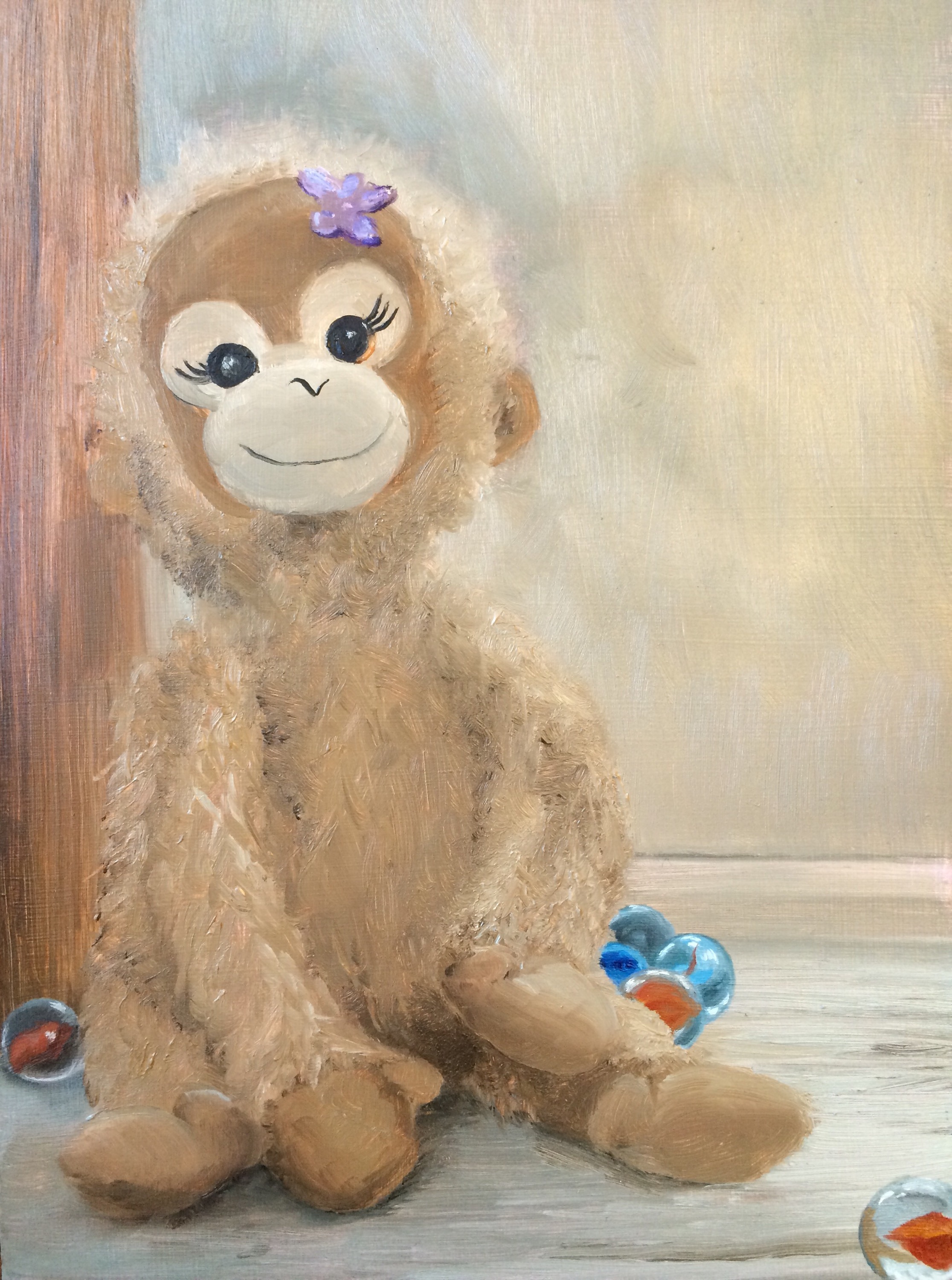
This is Baby Monkey. My little girl’s best buddy. Her constant companion for the better part of her life. So loved is Baby Monkey that I worried about her safety, constantly checking to see that she hadn’t been left behind at stores, hotels, airports. The perfect size to clutch in a chubby little 3-year-old fist, she went everywhere with us.

But my little girl isn’t 3 anymore. She’s 6. Tall, headstrong, funny, bold. Baby Monkey stays home most of the time nowadays, no longer making trips to the grocery store and school. Recently, though, after a long day out my daughter said, “I want to go home. I want to go home and see Baby Monkey.”

Still special. Still loved.

Hello, darlin… nice to see ya

It’s been a long tiiiime…

Hello there stranger! How the heck are ya? Do you even remember me? I’m sure that’s questionable. Remember in my last post I promised you that I would tell you soon what was keeping me so busy. Apparently I lied. I apologize.

See here’s the deal. I had a baby! I say that like it just happened. Oh no. It wasn’t recent. It was so long ago now I’m embarrassed to say. Embarrassed because while a new baby might be a reason to neglect a blog, a 20-month-old, despite the fact that he’s into everything, seems like less of an excuse. The thing is that while I expected that to mean extra work, no one told me that the craziness increases exponentially with each child so that 2 children is somehow through some mathematical mystery 4 times the work. I would imagine that people with 6 children never ever stop moving and never take in any sustenance but the last drops in the bottom of a juice box and the 1/2 a chicken nugget child #4 dropped on the floor that the dog failed to notice. So hats off to those of you that make multiple children look easy. But I digress. Where was I? Ah yes. Kid x 2= Work². However, it’s also Fun², so while there’s extra cleaning messes, laundry, correcting, containing, and refereeing, etc; there’s also extra snuggling, kissing, teaching, learning, and laughing. It’s good. It’s great! But it is busy.

I am very happy to say, though, that work as been busy as well. I’ve done several commissions which I have really really enjoyed. I love the collaboration involved in helping someone flesh out what they want in a painting and bringing it to life. My commissions have ranged from an oil painting done from an old photograph of the client and her mother, to a traditional portrait, to a portrait of a beloved stuffed bunny, to tiny boots and baby knees (plus a couple of pet portraits not shown here). The work has been varied, but so so good with each piece presenting its own challenges, learning opportunities, and rewards. I’ll probably go into detail about some of these in future posts, but for now here’s a brief glimpse of what I’ve been up to since the new kid came along:

This slideshow requires JavaScript.


The “Skin”ny on Skin

Forgive the title…I’m kind of a dork…

Yowzah it’s been a long time since I posted! So long that I forgot my password to log on to my site! I have been very very busy with things that I will share with you at a future point. However, for the moment, I’m STILL busy. I do want to show you a piece that I finished a few months ago, though, that I’ve yet to share. It’s a diptych (which is a fancy way of saying that it’s on two panels). I had so much fun with the colors in the skin tones-greens, violets, reds… To anyone reading this who is not a (totally obsessed with tiny details, value shifts, and color changes) realist artist, that statement probably sounded weird. I mean, caucasian hands should be painted in caucasian flesh tone, right? Yeah right, and grass is green and apples are red. Ok, well, those last two are true even though much more goes into those than meets the eye as well. But skin… how can I begin!? Skin is an organ, right? The largest organ of your whole entire body. It is a living thing with blood flow, covering muscles, tendons, ligaments, bones. And because it’s translucent, those elements underneath affect the color of the skin on top.  So, take that complexity and add to it some other factors like form, light, shadow, the hills and valleys that make it look like a hand instead of just a lump of peach or brown clay and it gets pretty colorful. Your amazing brain is so amazing that it takes in all those details and processes them without you even noticing, then says simply to you, “That? That’s a hand.” So, take a minute. Look at the back of your hand. Wiggle your fingers and notice how the shape of the shadows changes as you do so. Pretty cool, huh? Now tell me, what color is your skin?

Tug of Love

Tug of Love, detail

Wish Her Luck!

My painting, “Love Letter to the Here and Now” has been accepted into the Meridian Museum of Art’s Bi-State Annual Art Competition. IMG_3651Last week I hand delivered the painting to the museum in downtown Meridian, MS. With a bit of nervousness and one last loving look I left my brainchild in the capable hands of the museum staff. Good luck, Little One!

Love Letter to the Here and Now

Hey y’all, remember me? Ages ago I posted (here!) the beginnings of a portrait I was doing of my little girl. However, I just realized I never shared the completed painting. So, I present to you “Love Letter to the Here and Now.”

IMG_3651

“Love Letter to the Here and Now” by Erin Hardin- Oil on Linen

The title speaks to both the fact that the prototypical “dad with the video camera” is using a smartphone to record his child’s accomplishments.

Detail from "Love Letter to the Here and Now"

Detail from “Love Letter to the Here and Now”

However it also truly is a love letter to my here. My now. Which I have to say, is pretty great.

IMG_3651_2

My here. My now.