September 2023 I took on the challenge of painting 30 paintings in 30 days! For a slow, detailed painter like myself, this seemed like a pretty monumental task…which is exactly why I did it! This stretched me in so many ways.
Teaming up with me for this adventure was Artefex, a small California company that makes beautiful artists’ panels in a variety of surfaces. Their Aluminum Composite Material (ACM) panels come in so many options, it can be a little mind boggling. So, let me break down what I found for you.
Allinpanel- Great for building up texture easily
First off, let’s talk about the Allinpanel. This panel consists of linen in a variety of weaves (medium, fine, and extra fine) mounted on a rigid, archival ACM panel and comes primed with your choice of acrylic priming or oil priming.

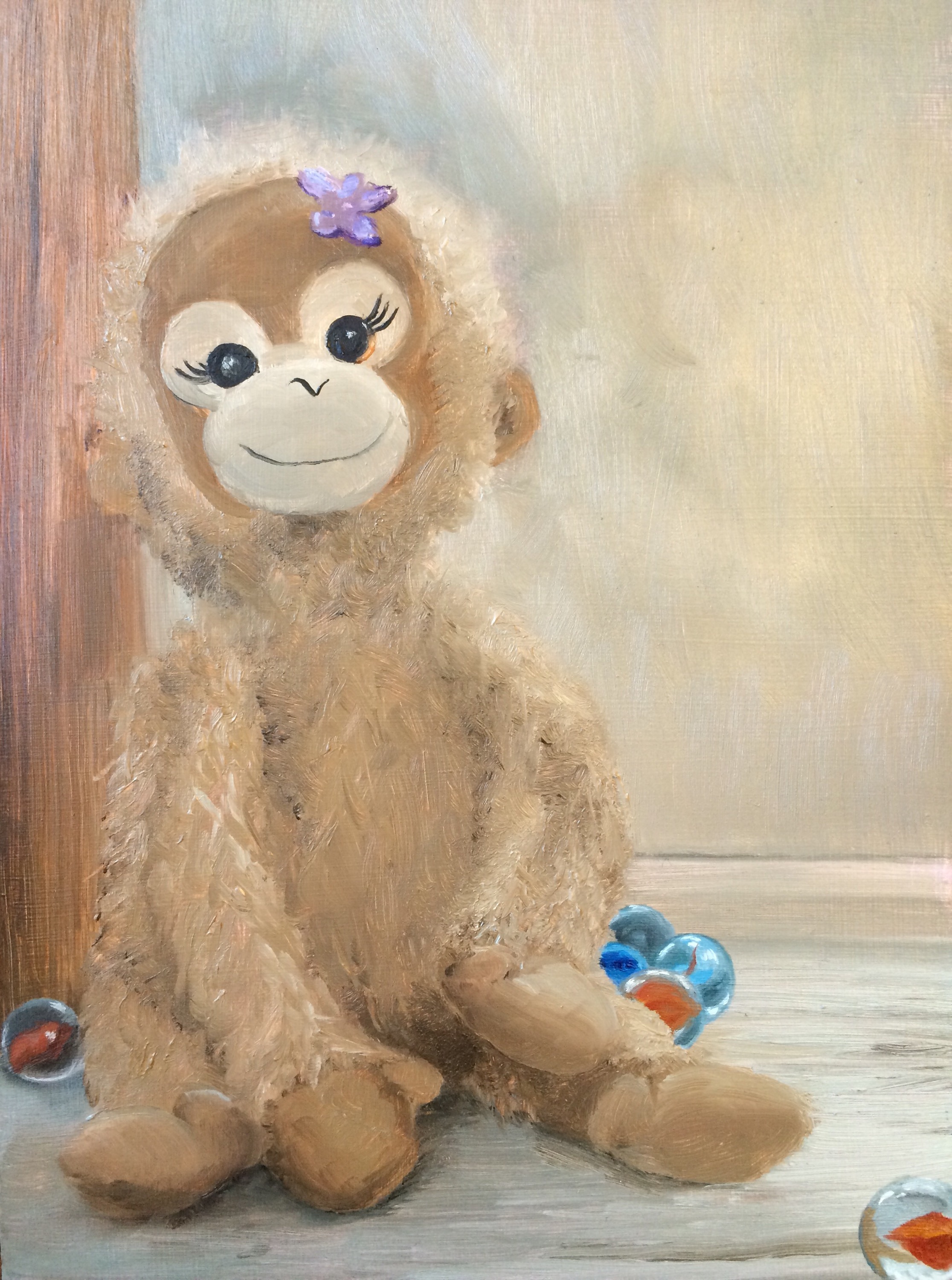
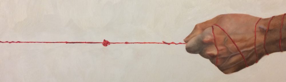
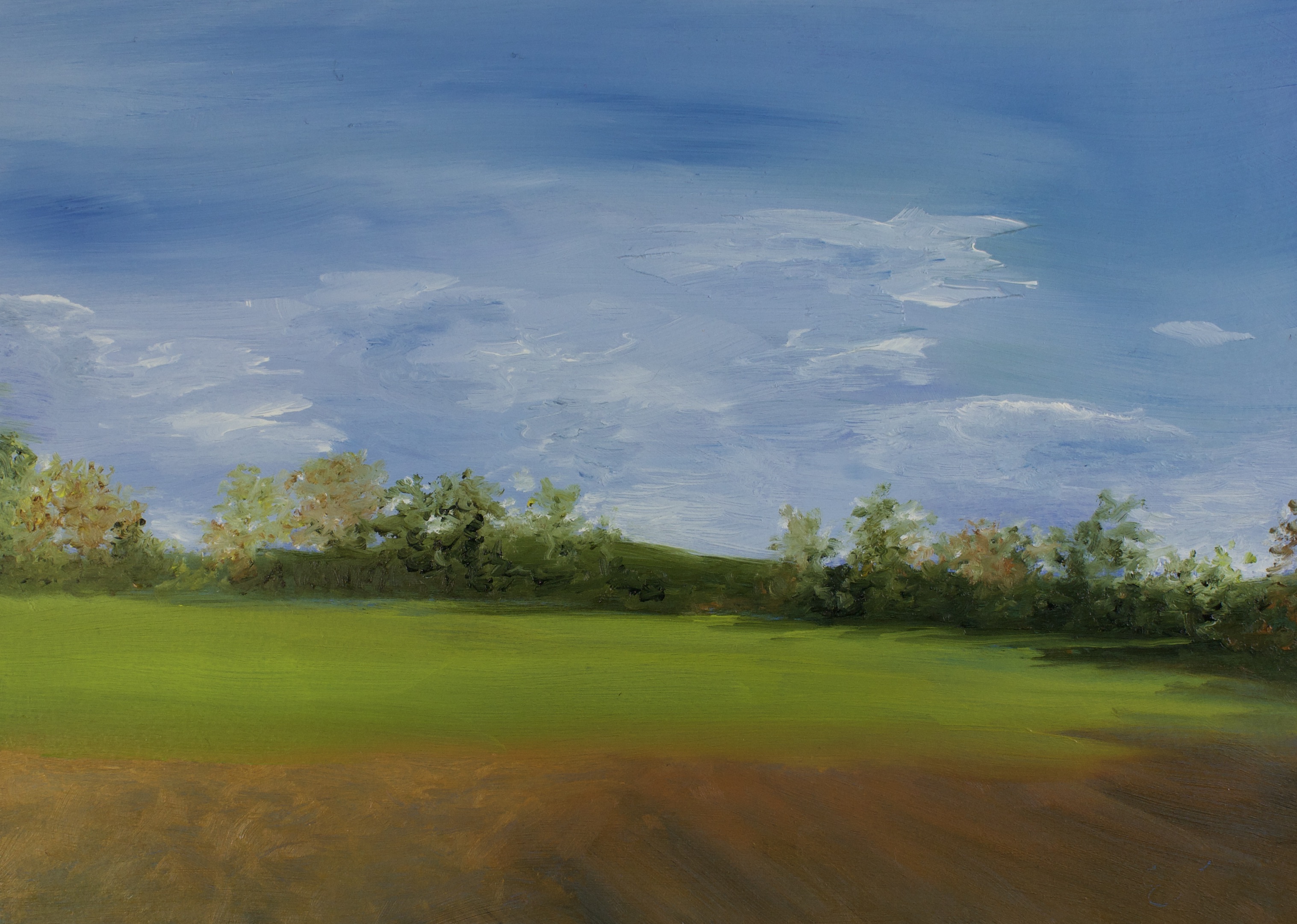
This first painting of this 30 day series was on a medium weave, oil primed Allinpanel. I’ll be honest, at first I wasn’t so sure about it. I usually go for a smoother texture. However, it turned out to be exactly the panel I needed. The medium weave had considerable drag, but that made it the perfect panel for a heavily textured, alla prima painting. I was able to lay down thick tiles of paint without pulling up previous layers. By some magic, however, this texture somehow didn’t get in the way for areas of the painting where I wanted a smoother effect. This is a great panel if you want to build up thick layers of paint quickly and add a great deal of texture, especially if your style is a little looser.


If you still want some tooth, but you like a slightly smoother surface, the Allinpanel in fine or extra fine might be a better option for you. There is still some considerable brush drag on the initial layer, but not as much as with the medium weave. As with the medium weave, the linen texture made it easy to apply paint and build up layers, however, because the weave is finer, you have much more control over the tiny details. These are beautiful panels for both direct and indirect painting styles.
As I mentioned, the Allinpanel is available in both oil primed and acrylic primed. If you’re an acrylic painter, you’re strictly limited to the acrylic ground. However, if you’re an oil painter, you can take your pick. The panels perform very similarly, but I found the acrylic priming to be a little more absorbent.
Alcot- Really unique surface. Great for going back and forth between adding paint and taking off paint. Good for working in indirect layers
Speaking of acrylic, Artefex has another great acrylic primed option. The Alcot panel is cotton polyester mounted to ACM panel. Like the Allinpanel, it is available in medium, fine, and extra fine weave. However, as opposed to the Allinpanel’s irregular, linen weave, the Alcot panel has a uniform weave. That’s really where the similarities end. This is a really unique panel. To be honest, it takes a little getting used to.

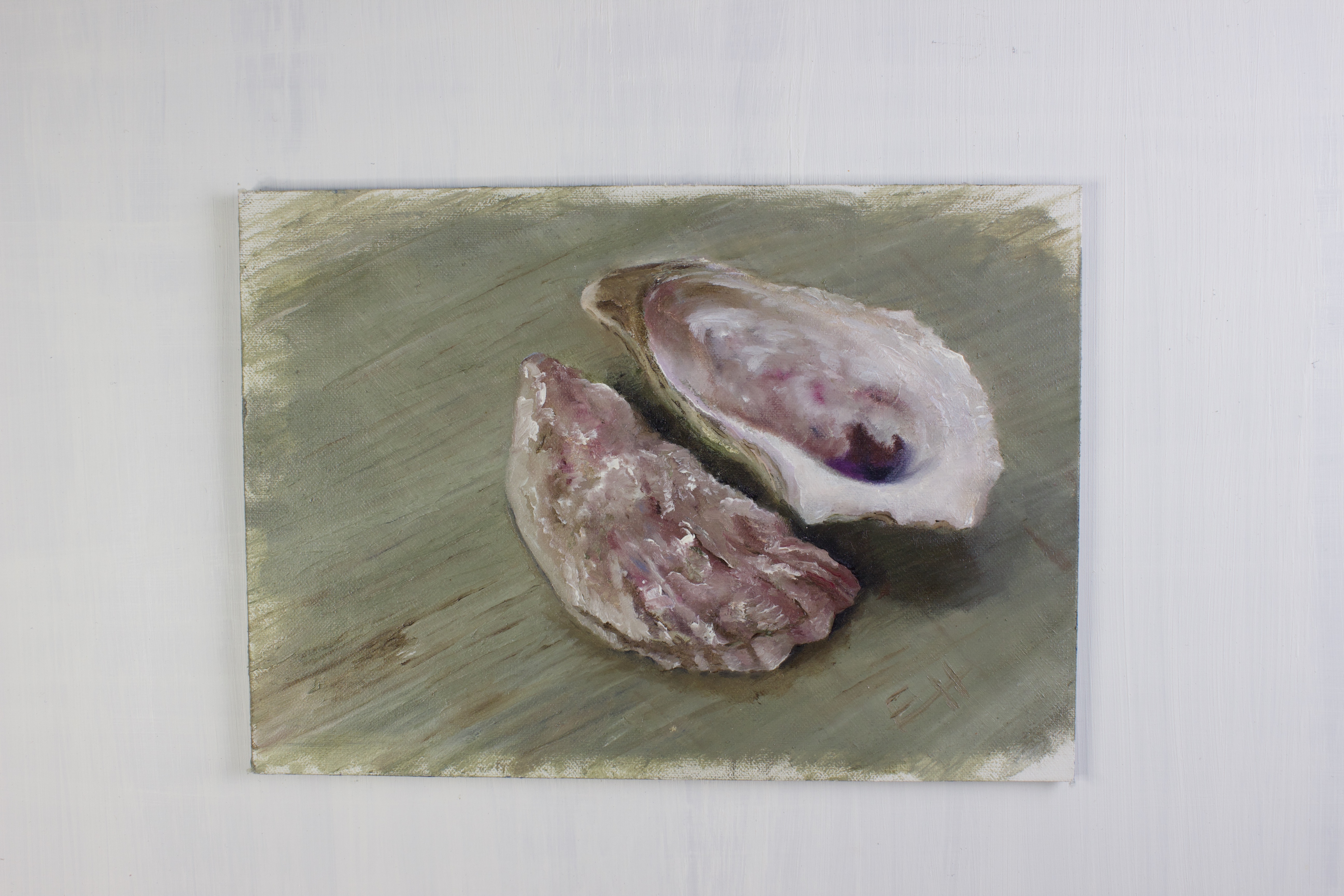
This trompe l’oeil painting of a feather hanging from a painted cedar plank was painted on a fine-weave Alcot panel. I fought with laying down paint and building up texture without picking up wet paint from the previous layer.

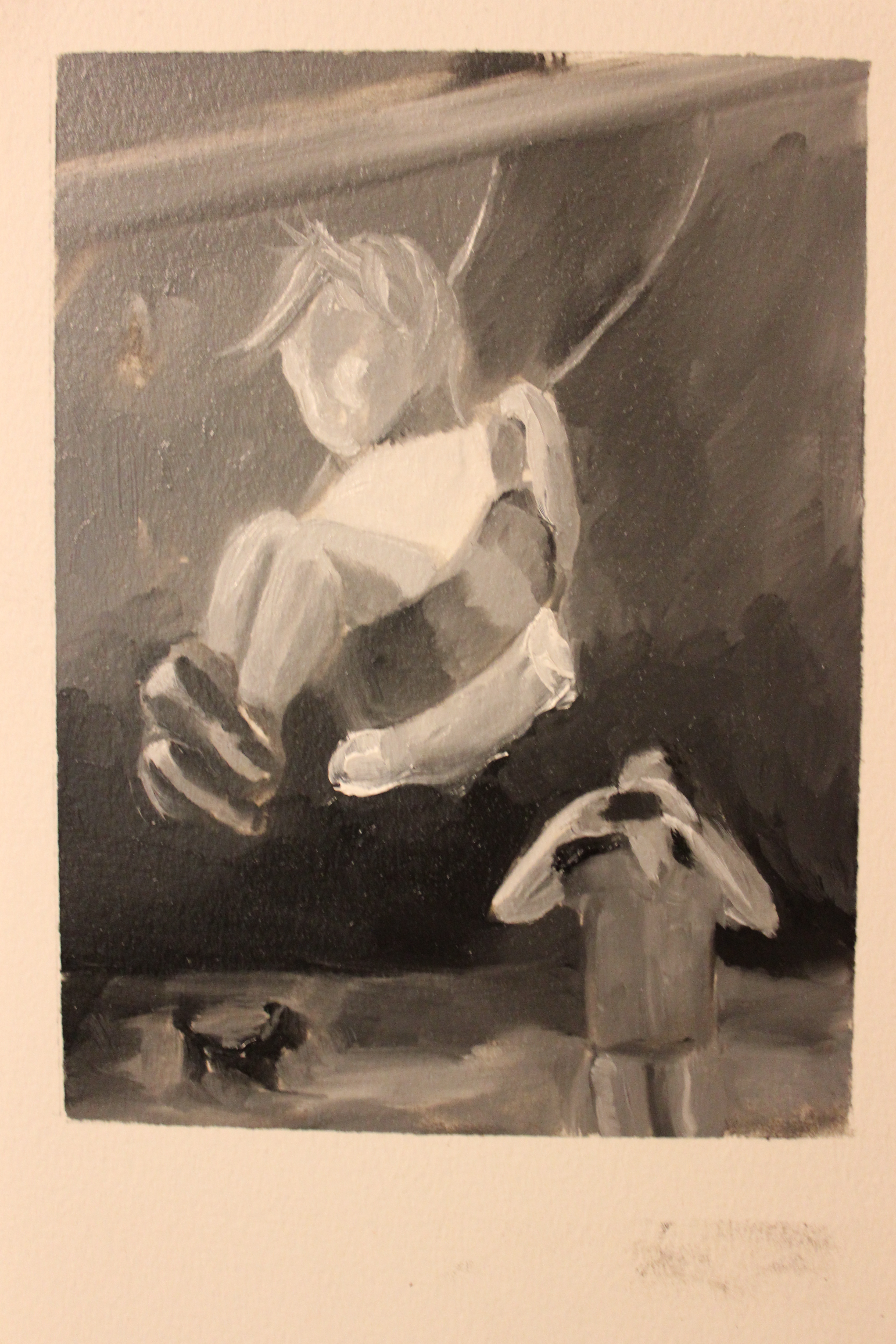
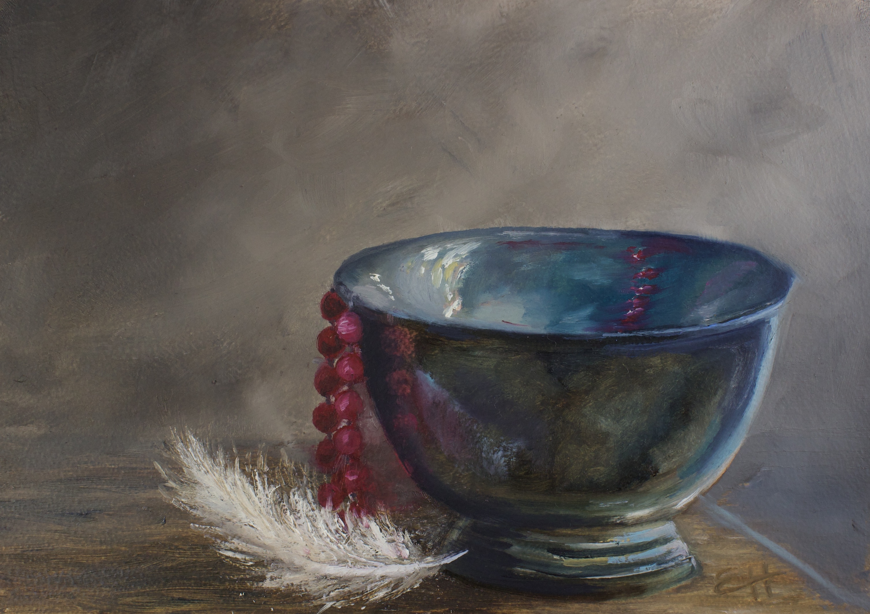
The next painting I did on an Alcot panel, “Beckoning,” started out the same way and I ended up scraping off a fair bit of my paint in frustration.. THAT’S where it got fun! The areas where I scraped the paint maintained the really beautiful, glowing paint layer that I was able to build on a little more easily. I realized that in expecting it to behave like an Allinpanel, I risked missing out on what it actually is- a panel that’s somehow both textured and slick at the same time. Once I got the grasp of that I really started loving this panel! This is a great panel if you like to play with adding and then scraping paint; building up and taking off texture in different areas. I personally like the fine and extra fine weaves the best, but if you like your texture to show, the medium is a great one. Note: After I completed this 30 day project, Artefex released an oil primed option. I cannot wait to try it!!
Oleopanel- Oil painters only. My favorite for indirect painting and minute details, but also great for alla primas
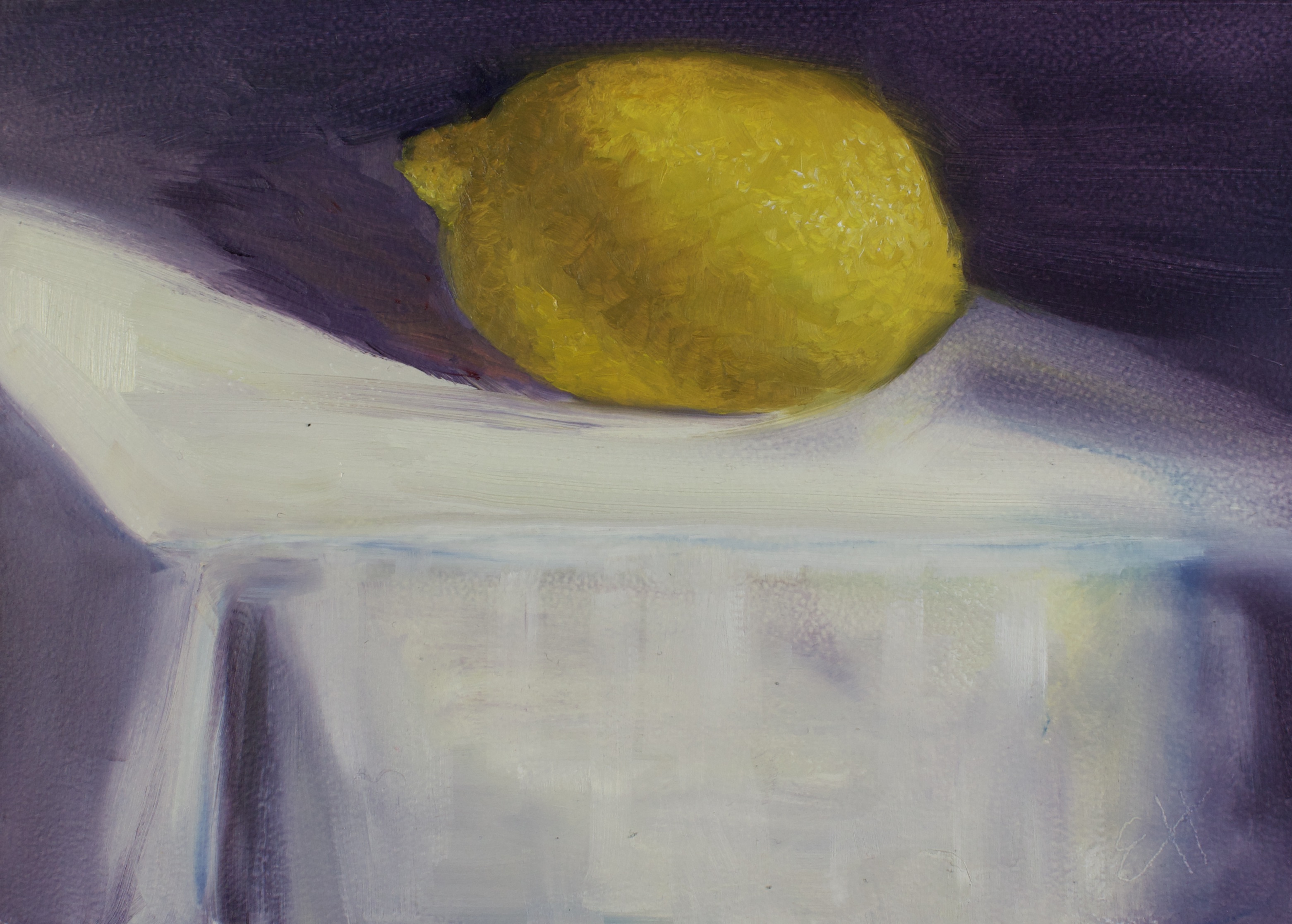
While we’re on the subject of oil priming, Artefex’s next option for oil painters is the Oleopanel. Unlike the Allinpanel and Alcot panel, which have linen or canvas adhered to the panel, the Oleopanel has a lead oil priming applied directly to the ACM panel. It’s available in a slightly bumpy, eggshell texture, and a smooth texture. These are absolutely beautiful panels, especially if you like a smooth surface. The paint goes on like a dream and feels SO smooth, with enough tooth to keep it from slipping and sliding off the surface of the panel. Even with all this smoothness I was able to add layers and build up texture with a direct painting method, though not as easily as with the Allinpanel. The slight texture of the eggshell Oleopanel was easier for alla prima painting than the smooth, however both the smooth and the eggshell handled thick paint application more easily than I expected from such a smooth surface. Though they can be used for direct painting, I think the Oleopanels are best suited for a more indirect painting style.


Tempanel- Very versatile and unique
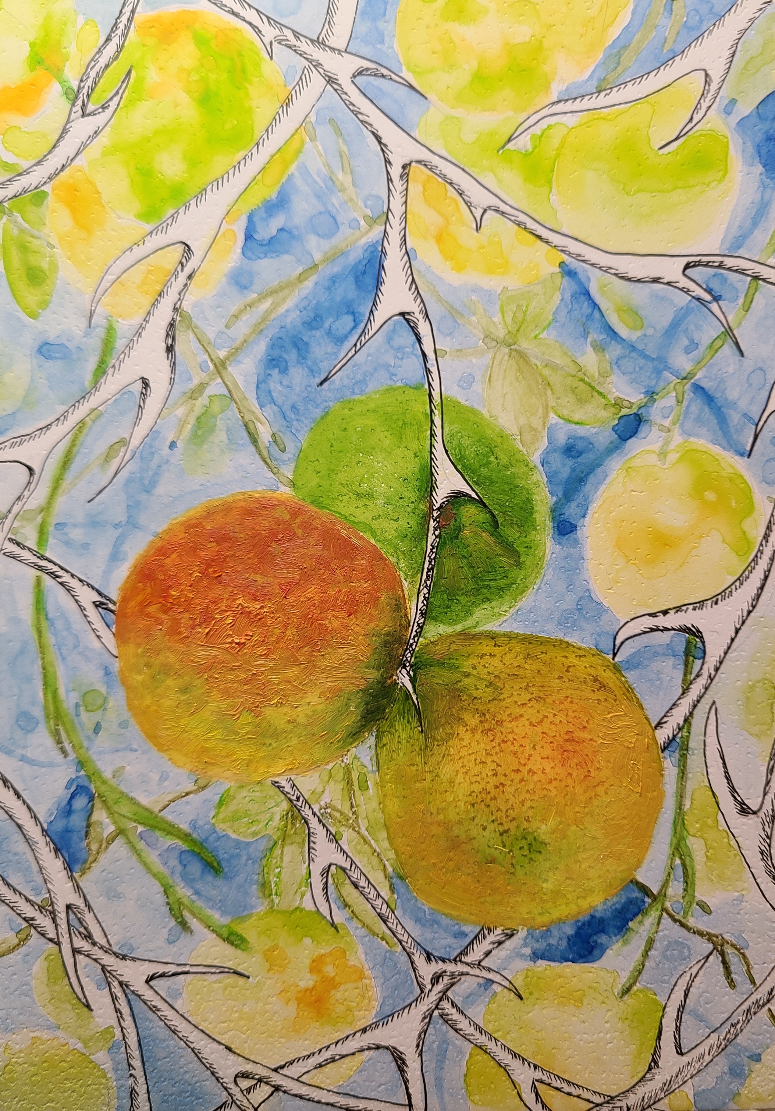
Artefex Tempanel is another truly unique panel. Originally intended for tempera painting, this absorbently primed panel can handle a huge variety of mediums. The priming is a little hard to describe. Just to play with all the different options, I used this panel for a mixed-medium piece, trying out pen and ink, watercolor, and oil paint. First off, I loved drawing on it. The pen handled the way it would on really nice paper. I loved the way the watercolor handled as well, but it wasn’t quite what I expected. It sort of sits on top of the surface, sinking in slowly. If I had expected it to respond the way it would on paper, I would have been flustered, however, I was just playing and experimenting and I loved the outcome. While the surface wasn’t as absorbent as I expected for the watercolor, it was more absorbent than I’m used to when working with oil. I actually ordered more of these panels to play with some more because they really are so different and interesting. In addition to the mediums I tried, you can also use acrylic paint and dry mediums.
Chartapanel- Drawing and watercolor
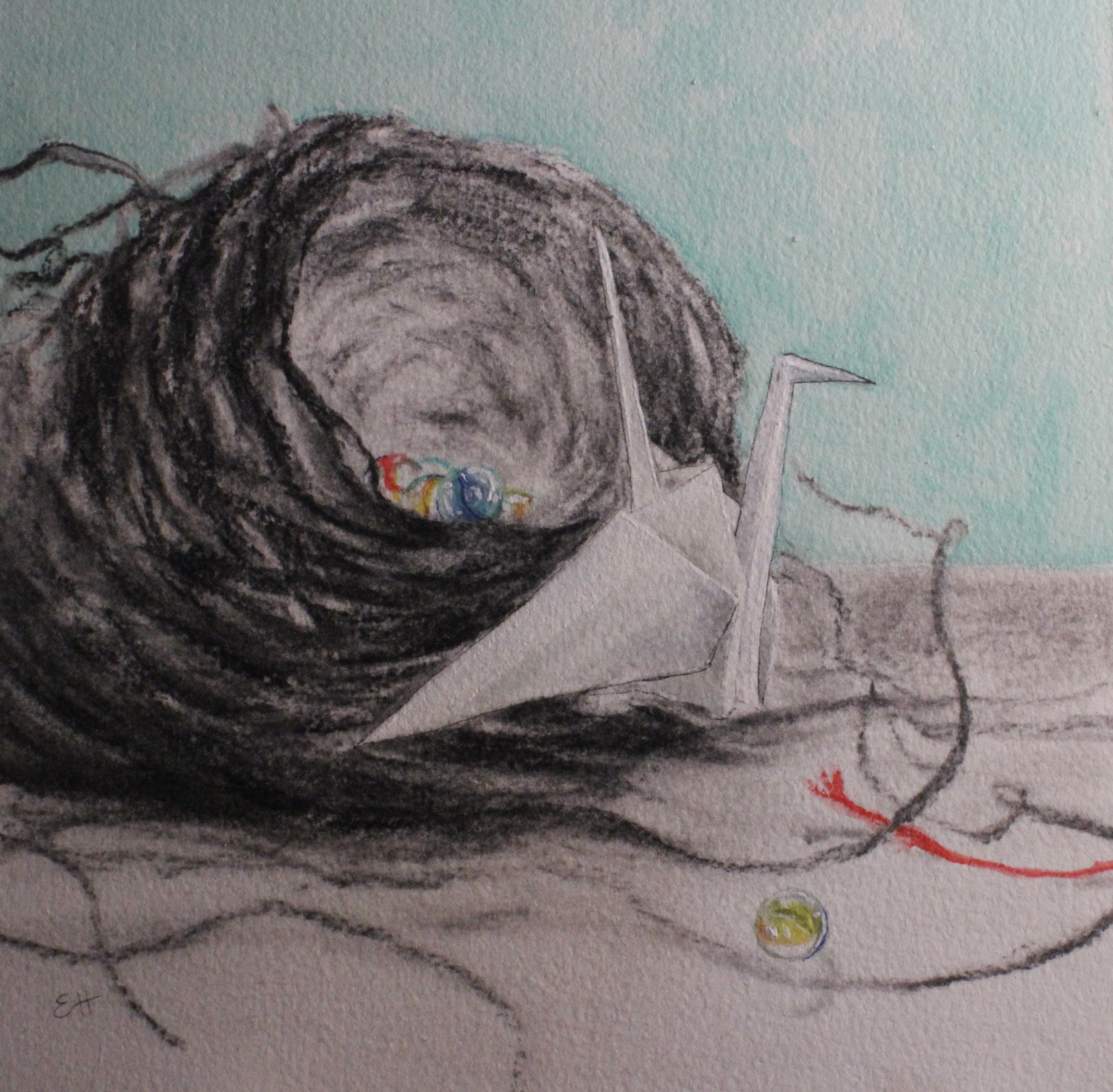
Speaking of dry mediums, Artefex has other panels for that, too! The Chartapanel! These ACM panels are mounted with either Arches Coldpress Watercolor paper, or Strathmore 400 drawing paper. To try out these two different papers side by side, I painted a diptych. The Arches watercolor paper has an absorbent texture, making for lovely soft edges. Though intended for watercolor, it can also be used for dry medium (such as the charcoal shown here). The Strathmore drawing paper has a smooth, crisp finish, making for sharp lines and clean edges. Though intended for drawing, it can also handle watercolor (again, as seen here). I love the concept of mounting watercolor and drawing paper to these archival panels, because it solves so many problems! Being on paper, watercolor paintings are automatically more delicate and harder to preserve and restore. These panels are impervious to the effects of time, so using them to support this delicate paper makes loads of sense. Plus, no matter how much water I used the paper didn’t wrinkle, curl up, or separate from the panel at any point. Brilliant!

Copper- Unprimed, very archival, very slick. Great for thin layers, indirect painting
Last, but not least, the copper panel. Aaah, I love copper! That glow is so beautiful! Because it’s so beautiful, many artists choose to leave a fair bit of it showing. However, I personally like to paint thinly over it- just enough to knock off the shine a bit while still letting it glow through. I have seen artists paint in an alla prima style on copper, but it’s slick…SO slick! It’s hard to get the paint to adhere and the first layer will likely be streaky. Because of this, I like to work in thin layers, letting each layer dry before moving onto the next, but that’s just me.

So there you have it! The Artefex panels! I hope this guide makes it a little easier for you to choose. I really have nothing bad to say about the panels or this company. Feel free to reach out to me with any questions, or talk directly to them! They’re so responsive and knowledgeable. You can find them at https://www.artefex.biz/
I originally wrote about my entire painting journey in my newsletter. My loyal band of newsletter subscribers gets updates, new paintings, and behind the scenes stories direct to their inbox before anyone else. If you’d like to join us, we’d love to have you along! You’ll find the sign up link at www.ErinHardinArt.com.