Let’s Try This Again, Part III

Bit by bit I’m moving along on this painting. I’m loving it, but my little one has decided naps are for chumps so I’m not getting to work on it much. That’s ok. Next week she starts pre-school so I’m trying to soak up every sweet, frustrating, fun, non-work productive, bonding, silly, frivolous, educational, and mundane moment with her. I have the rest of my life to work. Here and there, though, I have made some progress on it.

Last post I showed you my rub-out underpainting:

Now for the fun part- color! Here’s what I’ve done so far, plus a couple of detail shots.

Don’t you love skin tones? Look at all the colors in there- greens, pinks, violets- and I can promise you there’s not a bit of pre-mixed “Caucasian Flesh Tone” on my palette. Where would be the fun in that?

Ok. Let’s try this again

A while ago I showed you this in-progress picture:

IMG_1194IMG_1195


with the promise that you would see it transform along the way into a finished painting. I lied. I didn’t mean to! Sometimes I just can’t finish a painting. There’s certainly something to be said for committing to a project; working until your idea comes to fruition; pressing on until the bitter end. But there’s also something to be said for stopping when you realize that what you’re working on just isn’t “you” anymore. That is not to say the same attitude should apply to every situation that bores you, or even to every painting, but of all the commitments you could flake on in life this is one case where the earth will not shatter, hearts will not break, and jobs will not be lost (unless, of course, it’s a commission- which this was not so I’m free to do what I want. So there!).

Now, let’s try this again with a painting I know I’ll finish- in part because I’m much more more in love with the subject matter. A portrait of my daily life.

To start I did a value study:

IMG_2393

Value study on Ampersand Oil Paper, 6″x8″

A quick laying down of the lights and darks of my composition. This is done on a small scale (in proportion to the size and shape of the finished painting) quickly and loosely, with no gridding, no drawing, and no blending. The purpose of this step is just to help you check the balance of lights and darks in your painting. For example, this composition stands alone because it is primarily dark with a bright white center of interest. When paintings edge too much toward mid-range in value, they get dull no matter what your colors or subject. Value studies are helpful, though because you don’t get distracted by the pretty colors or elaborate patterns and you can really see the bones of the picture. So far, so good. And I’m not a bit bored.


Coming out of hibernation, continued

Step 2: Local color-

Image

Loosely applied, basically just blocking out the different areas of the picture. At this point I’m trying to close my eyes to detail and just get blocks of color in place. I didn’t even work too hard to cover up my base color, since I want that warmth to ultimately show through.

Coming out of hibernation

February in Alabama is wet, cold, and grey. A perfect recipe for malaise. Will I hibernate? Will I huddle under the covers and whine? Will I crawl into bed with a pan of lasagna and try to get as fat as possible? Not this kid… not anymore at least. Let’s get back to work. And this time I think I’ll try things a little differently.

IMG_1192

Step 1- Underpainting rub-out

Gamblin’s Solvent Free gel mixed with transparent earth orange (about 50/50).

The underpainting acts as a value study- letting me study the dark and light areas of the painting and decide if the composition is interesting enough to stand on its own without the color.

The paint/gel mixture is applied to the entireIMG_1194 canvas (or in this case primed panel) with a large brush, then, using a t-shirt rag I rub out the lighter parts of the painting, using varying pressure to get the gradations of value.

Stay tuned for more… unless I go back into hibernation mode. Then you can find me on the couch with a pot of chili.

My Virtuous Vice

I have a vice. It’s probably one a lot of you share. Like many vices, it’s hard to resist. It’s not normally seen as a vice. In fact, in this culture of more more more, it’s typically viewed as virtuous.

Multi-tasking

The following is a true story, and typical:

I put on moisturizer in the morning. While waiting for the moisturizer to soak in, I begin brushing my teeth. When I reach for the toothpaste I notice a cup on the bathroom counter than needs to go in the dishwasher, so toothbrush in mouth, cup in hand, I head to the kitchen. When I get there I realize the dishwasher needs to be unloaded, so one-handed (I’m still brushing my teeth with the other hand) I begin unloading the dishwasher. Teeth brushed, dishwasher half-unloaded, I return to the bathroom to rinse my mouth and put away my toothbrush. While there, I realize I never finished applying my make-up. Powder on, mascara out, I realize I never finished unloading the dishwasher. Mascara applied quickly, I return to the kitchen where I find my husband, unaware that the dishwasher was half-unloaded (because really, why should it be??) putting dirty dishes in the with the clean. Amidst all of this there is also some toddler juggling going on. This. Should. Not. Happen.

IMG_0524

So, in a quest for sanity, peace of mind, and just all-around efficacy, I’m trying to rid myself of my multi-tasking ways AND as I’m going to tell you all about it (Didn’t you know I would?).

Now, where was I…

After finishing this painting-

IMG_0009Erin Hardin- Winter Warmth

“Winter Warmth” 24″x36″ Oil on Copper, $2000

I took a break from painting on metal for a little while. However, I just can’t stay away.

For the past year (among other things) I’ve worked on a four piece series commissioned by a customer as a gift for her father. Working in my “Reflection Series” style, I’ve been creating compositions to represent the four seasons. For Christmas last year, her father received this painting-

IMG_7779

T.J.’s Winter, 12″x12″ oil on copper

For Father’s Day, he received this one-

T.J.'s Spring, 10"x10" Oil on aluminum

T.J.’s Spring, 10″x10″ Oil on aluminum

And now I’m about to begin the next in the series, summer. Join me over the next several weeks and I’ll show you how I go from this

IMG_0360

Aluminum mounted on panel, ready for painting

to a finished painting.

Laying the Foundation…

I just got some beautiful new birchpanels from Micah Bailey of Oak Hill Farm (contact me if you’re in Alabama and want to order panels from him). They’re so pretty I almost don’t want to paint on them… but of course I will. First, though, priming.

As you probably know, you can’t paint directly onto wood with oil paints. In a nutshell chemical reactions between the oil and the wood cause the wood to disintegrate and the paint to change colors. Since I normally paint on metal or on pre-primed surfaces, I did a ton of research on how to prepare my panels. My best two sources of information were Ampersand’s website and the knowledgeable people at Gamblin Artist Colors. You can actually call Gamblin for technical support and they’re so so kind.

Just for kicks I tried a couple of different priming techniques to see what I prefer. I applied just plain ol’ clear gesso to one and Gamblin ground for oils to the other.

The gesso was definitely easier to apply and cheaper. But… I went with the Gamblin ground (btw, I swear I’m not getting paid for any of this by anyone). The reason- I love smooth surfaces and the ground (when applied correctly) gave me a super smooth finish. The process is a little picky, so here’s my best advice: a little goes a long way. I mean a really long way. Apply really really thin coats. Let it dry at least 24 hrs (if I put it on too thick it ended up being longer than 24 hrs). Sand, apply again. It says you just need 2 coats, but I actually did 4. Tada! Primed panel ready for some painting love.

Kid-friendly art storage

Aside

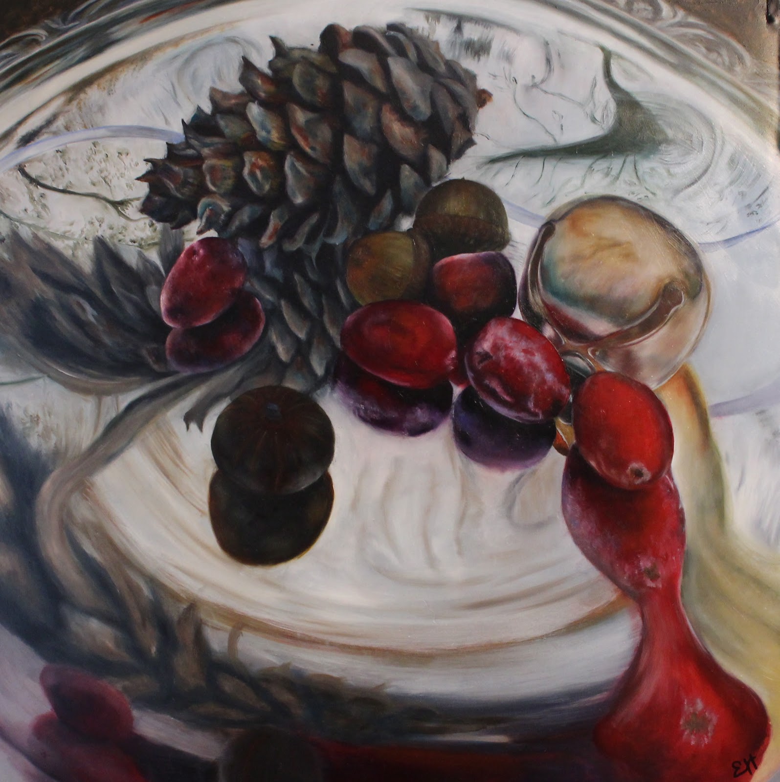
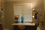
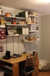
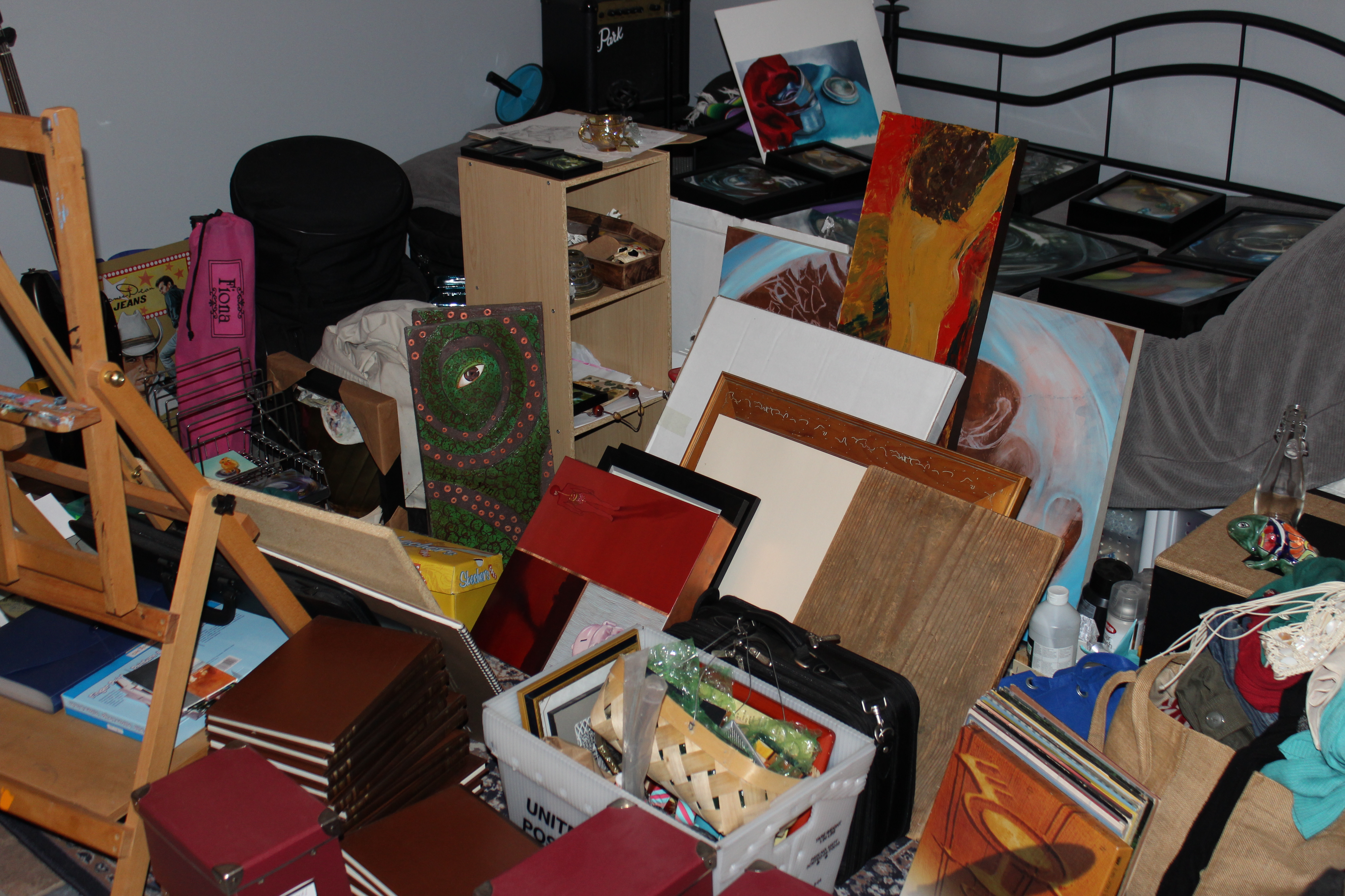
I used to hang my paintings on the wall as they were completed. However as paintings sold, commissions were picked up, new paintings were finished, etc. paintings were removed or shifted around and the walls were left with a bunch of nail holes. I couldn’t bear the thought of poorly planned nail holes in my beautiful new gray walls! My friend Drew mentioned the idea of putting them on a shelf, which hadn’t occurred to me. My tons of wall shelves that I added, while helpful, still didn’t give me enough room to store paintings. However I had a boxy particle board bookcase. I didn’t think to take a before-picture, but you know the kind- brown, faux wood laminate, moveable shelf, etc. I decided that shelf would work, but it most definitely didn’t go with the light, airy studio image in my head. Also, I was afraid to leave my paintings within easy reach of my toddler. Which leads me to another deficiency that needed to be addressed- I didn’t have any place in my studio that was kid-friendly, where perhaps the small one could occupy herself for 5 minutes. (Let’s face it- 5 minutes is probably the most I could realistically ask for.)

The solution? Multi-stepped, but easy and working out well for us.

First I sanded down the bookcase (just enough to rough it up) and applied Kilz Latex Primer. Then, I spray painted it white. Figuring that taking books or paintings off the shelf would probably be tough on the paint (since I’m sure latex paint on top of laminate is not archival), I covered the shelves with some decorative contact paper. Now comes my real innovation. I put felt feet on bottom of the bookcase so that it could be moved easily without damaging the floor (but not so easily that the wee one would likely move it) and I turned it to face the wall so that the paintings were not accessible. Lastly, I painted the back panel with chalk-board paint, cut, painted, and nailed trim around the “chalkboard” Voila! A storage spot for small paintings, a chalkboard for the kiddo, and a pretty piece for the studio. I love it when a plan comes together!

(I’m still having computer problems, so once again, forgive poor photo editing and cropping.)

Ta-Da! Studio!

This has gone on long enough. I haven’t posted in ages. Reason- computer problems (again!). I can get some photos to you, but I have literally no way of editing them, so forgive bad cropping, tilted angles, and bad light. I paint better than I photograph. Apple, if you’re reading this I’d like to have a few words with you….

Here’s my newly refreshed home studio. Cool gray walls, lots of shelves, aaah… much better.

Studio Re-Do, Part II

I’ve already shown you the absolutely dreamy perfect pale gray (with just enough green and just enough blue and just enough awesomeness) that I chose for my new studio color. As a reminder, here it is again.

IMG_9743

*Sigh…*

Now for the ugly part. The stuff. The tons and tons of “I might need this someday and what else do I do with it?” stuff. All piled into the center of the room…

IMG_8640

Keep in mind this is also home office stuff, including a zillion books. How did we get so many books? Do we really need college text books?

…or hauled into another room. Whew.


IMG_8638

yeah…. 

Don’t worry! It gets better! Stick with me!