Let’s Try This Again, Part III

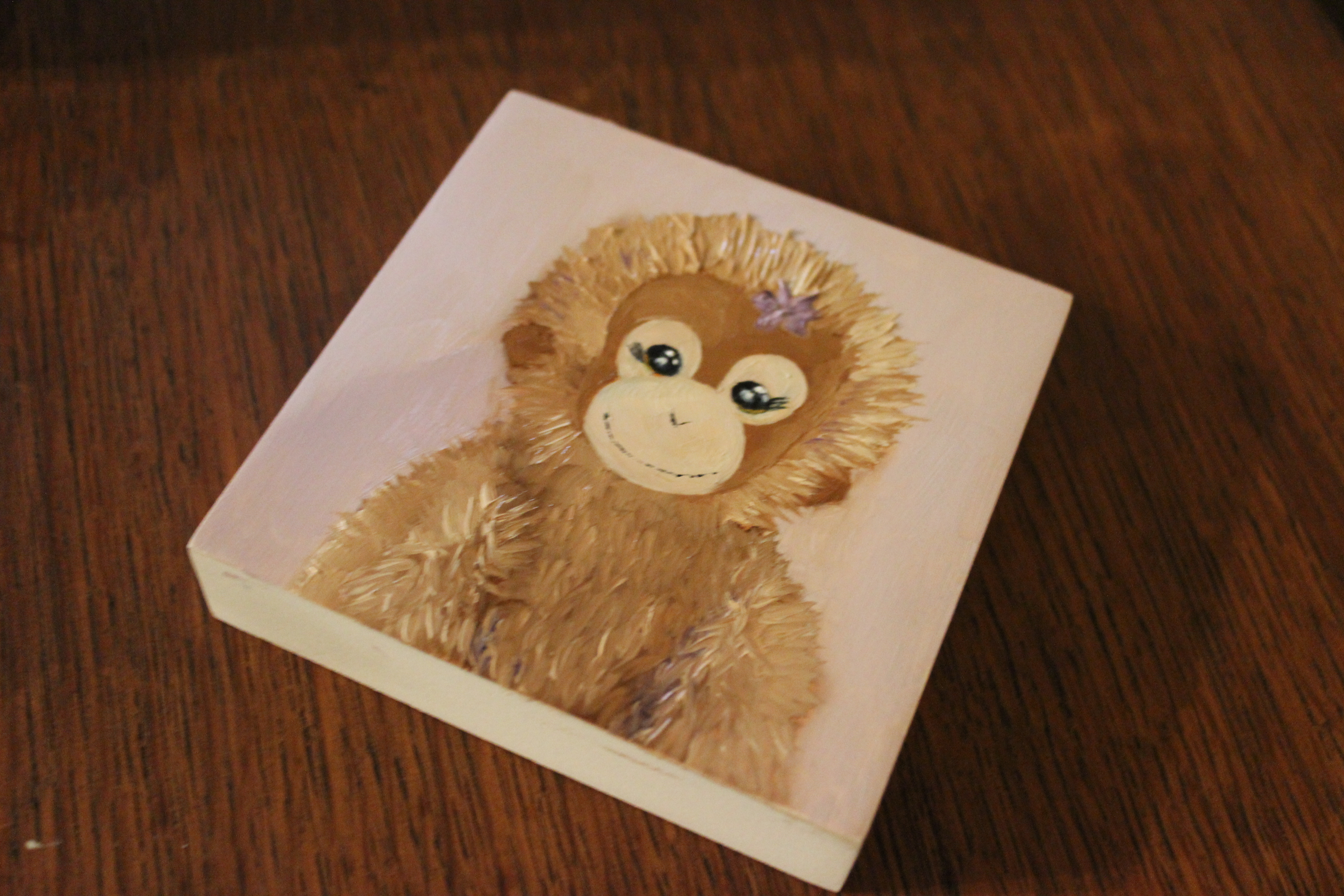
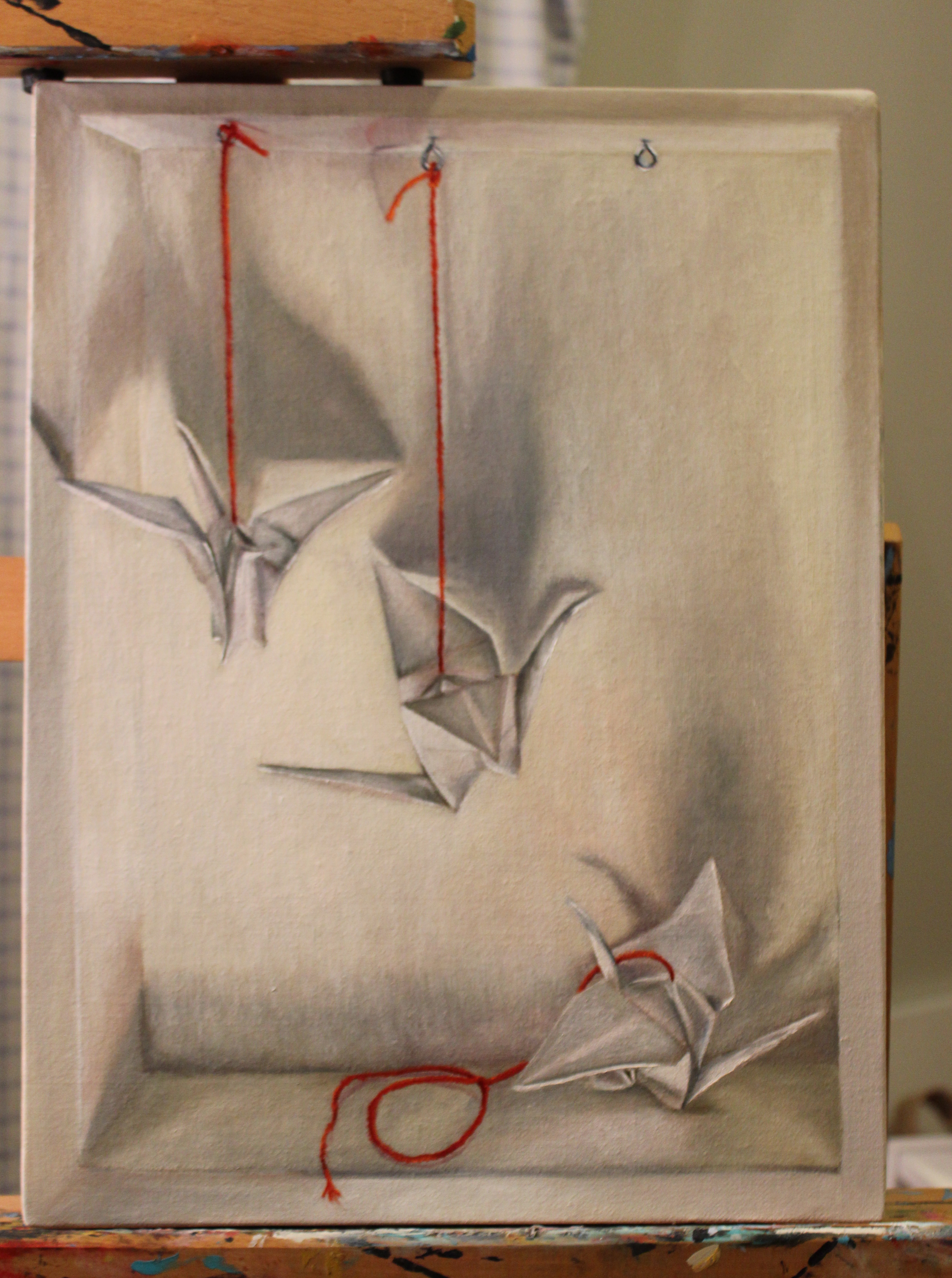
Bit by bit I’m moving along on this painting. I’m loving it, but my little one has decided naps are for chumps so I’m not getting to work on it much. That’s ok. Next week she starts pre-school so I’m trying to soak up every sweet, frustrating, fun, non-work productive, bonding, silly, frivolous, educational, and mundane moment with her. I have the rest of my life to work. Here and there, though, I have made some progress on it.

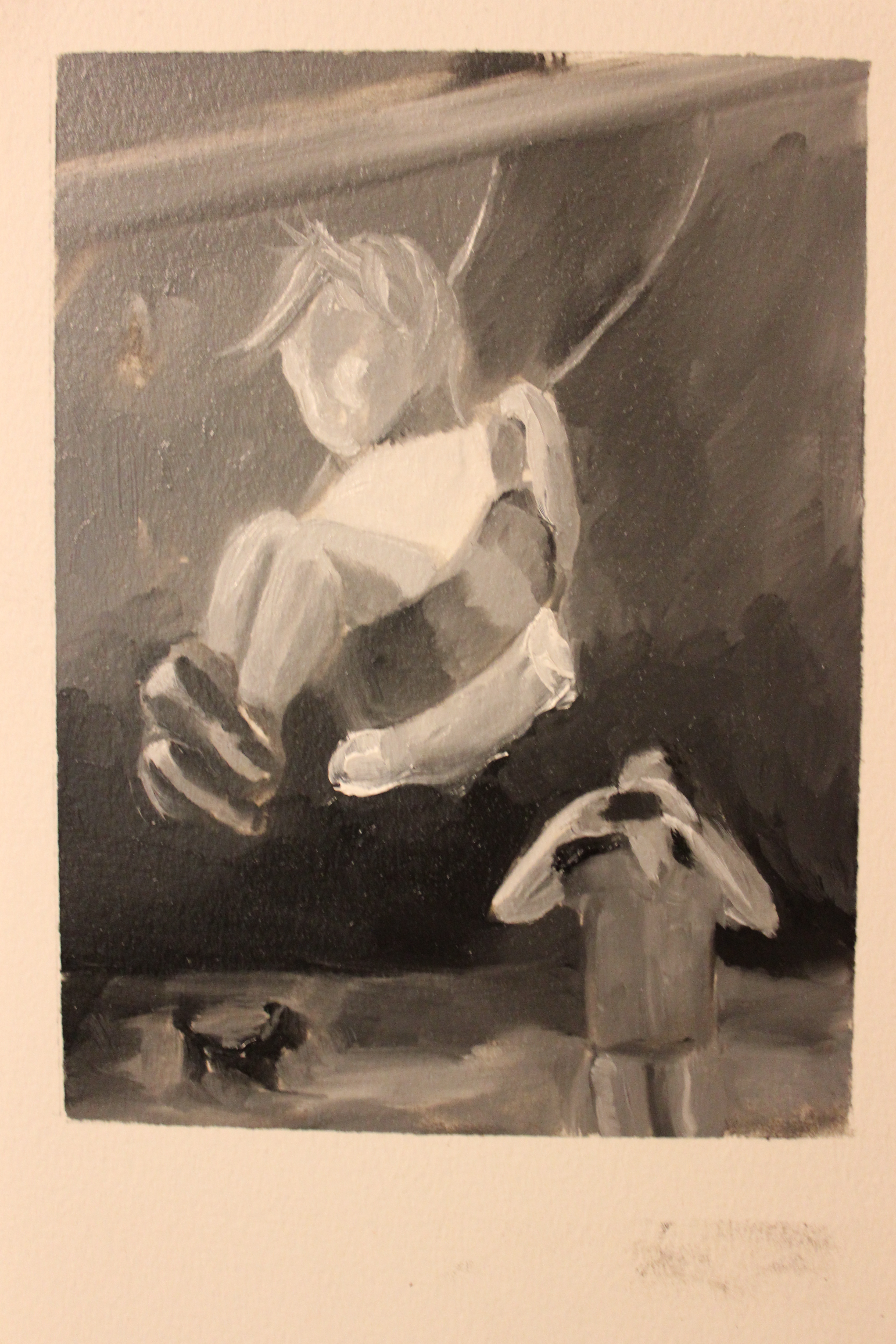
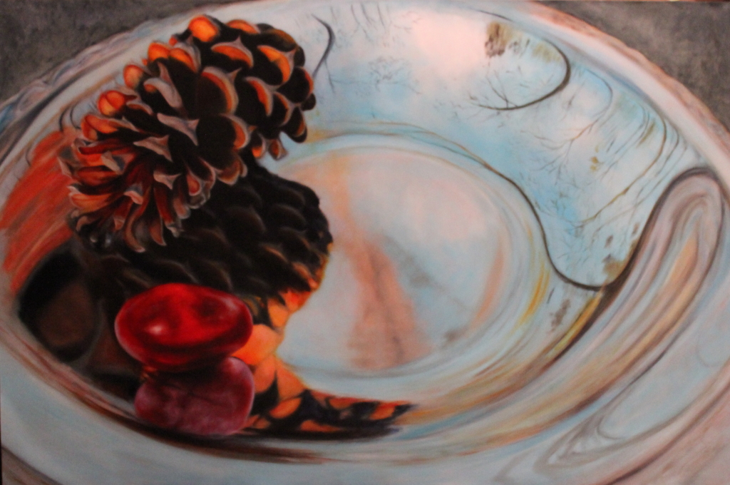
Last post I showed you my rub-out underpainting:

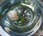
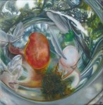
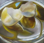
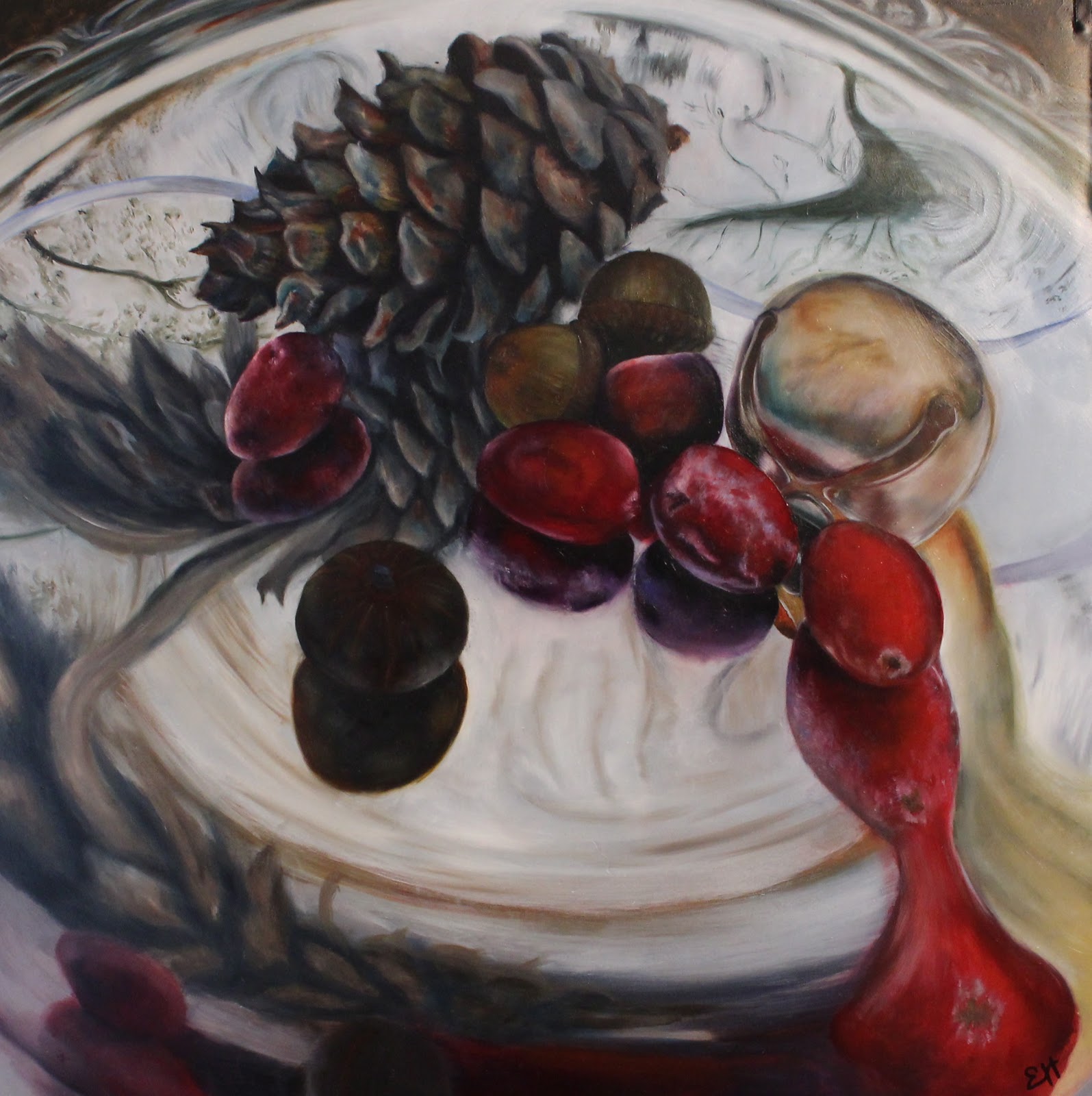
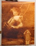
Now for the fun part- color! Here’s what I’ve done so far, plus a couple of detail shots.

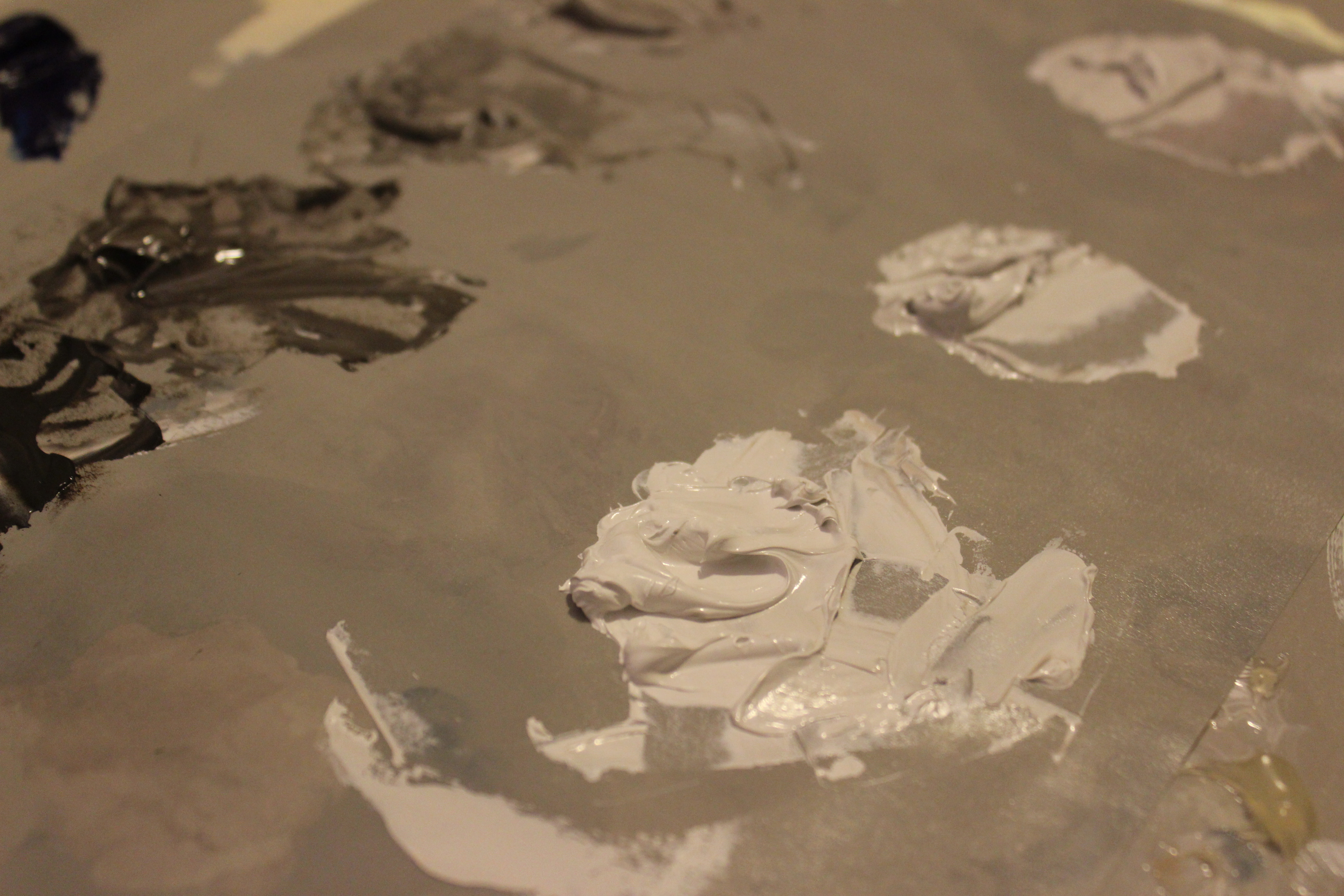
Don’t you love skin tones? Look at all the colors in there- greens, pinks, violets- and I can promise you there’s not a bit of pre-mixed “Caucasian Flesh Tone” on my palette. Where would be the fun in that?

Ok. Let’s Try This Again, Part II

Last post I showed you this value study I did in preparation for my next painting-

IMG_2393

Value study on Ampersand Oil Paper 6″x8″

Now I’m ready to start on the real deal.  First, the drawing:

IMG_2391

Drawing on canvas in sepia pen

Next, the rub-out. I’ve found that my initial little value study helps with this step. The more familiar you are with your subject and your values, the better. 

IMG_2394

Burnt Umber Rub-out

Next up: My favorite part- the magic part. Painting. Stay tuned. 


Ok. Let’s try this again

A while ago I showed you this in-progress picture:

IMG_1194IMG_1195


with the promise that you would see it transform along the way into a finished painting. I lied. I didn’t mean to! Sometimes I just can’t finish a painting. There’s certainly something to be said for committing to a project; working until your idea comes to fruition; pressing on until the bitter end. But there’s also something to be said for stopping when you realize that what you’re working on just isn’t “you” anymore. That is not to say the same attitude should apply to every situation that bores you, or even to every painting, but of all the commitments you could flake on in life this is one case where the earth will not shatter, hearts will not break, and jobs will not be lost (unless, of course, it’s a commission- which this was not so I’m free to do what I want. So there!).

Now, let’s try this again with a painting I know I’ll finish- in part because I’m much more more in love with the subject matter. A portrait of my daily life.

To start I did a value study:

IMG_2393

Value study on Ampersand Oil Paper, 6″x8″

A quick laying down of the lights and darks of my composition. This is done on a small scale (in proportion to the size and shape of the finished painting) quickly and loosely, with no gridding, no drawing, and no blending. The purpose of this step is just to help you check the balance of lights and darks in your painting. For example, this composition stands alone because it is primarily dark with a bright white center of interest. When paintings edge too much toward mid-range in value, they get dull no matter what your colors or subject. Value studies are helpful, though because you don’t get distracted by the pretty colors or elaborate patterns and you can really see the bones of the picture. So far, so good. And I’m not a bit bored.


An Homage

Those of you who have been following me for a long time may remember a post that I wrote on my former, blogspot blog. The post was entitled “Pockets of Joy” (click to read it). It was a sad post, and a happy post – A post in mourning of my dear dog Shag (aka The Shagster) who had recently died.

Now, around a year after the anniversary of his death, I painted his portrait. It was therapeutic and a celebration of the best dog ever. I present to you, The Shagster:

"The Shagster" Oil on linen

“The Shagster” Oil on linen

Oprah can do it, why not me?

I’ve discovered a few new favorite things and I’d like to share them with you!

#1- Grey palette paper

IMG_0817

Who knew it would make such a difference, but it’s SO much easier to see color against the neutral grey than against white. Worth the tiny bit extra. The brand I’ve been using is Jack Richeson and co, inc “Grey Matters Paper Pallette.” There are probably others out there, that’s just what my favorite art supply store, Forstall Art Center in Birmingham carries.

#2- A nice palette knife

IMG_0818

For far too long I’ve been thrifty (*ahem*, cheap) and made due with a plastic palette knife that wasn’t even the right shape. I would show you, but I actually threw it away after I used this one. It was one of those long, flat ones that looks like it’s made for buttering toast, not mixing paint. Again, who knew it’d make such a difference?

#3- Gamblin’s Solvent Free medium

IMG_0826

This is new and I love it. I used to use Liquin, but in hopes of keeping my studio as non-toxic as possible, I had to kick it to the curb. So far this seems like a great alternative.

#4- Bristlon Silver paintbrushes

IMG_0820

These brushes have great loading capabilities. I can put as much or as little paint on my surface with ease. Plus, they seem to hold up really well. That’s really saying a lot because I can be TOUGH on some brushes.

Trust me, it all connects.

For about a week now I’ve been attempting to NOT multi-task. Harder than it seems but surprisingly effective. Crazy as it sounds, I feel calmer and I actually feel like I’ve gotten more done. Even on days like last Monday when my dog licked a 10″ square portion of oil paint off a painting I’d been working on for two hours (FYI in case this happens to you- feed them and give them peptobismal. This is on a vet’s recommendation. She didn’t have a recommendation for what to do about the painting). I even managed to (for the most part) not multi-task when 20+ family members came into town for my daughter’s second birthday. It’s amazing how much nicer… calmer life seems when you’re really doing one thing at a time. However, I discovered a secret hidden area where I multi-task.

My brain.

That sneaky brain! Always trying to think about something else while I’m doing something entirely different. So, I’ve been working on mindfulness. Life’s too short and too precious to let moments slip away unnoticed while we’re not looking. So, several times a day I’ve tried to stop my inner narrative, my to-do lists, etc and notice where I am. Chances are it’s no place obviously special, but inevitably when I stop to notice there are special things about it. My brain is hyper. It’s hard to teach it to sit still for long. But, a little reminder several times a day, focusing for just a few scant seconds at a time, and I already notice it’s calming down.

On the subject of focusing on one thing at a time, in my latest painting I (mainly) focused on one color. White. I JUST finished it about 20 minutes ago, but I’m eager to share it.

IMG_0734

“Dare to Dream”
12″x16″
Oil on Linen

Man I love color!!! Look at all the zillion colors you can find just in white! Sorry, like I said, hyper brain. Anyway, this was really fun to do. And clearing my mind of all distractions and just looking for that myriad of colors imbedded in white paper and a white background was a great lesson in mindfulness. Tada! This blog post has come full circle. Namaste.

New in the Gallery

Don’t you love those errands that take you to an enjoyable part of town on gorgeous early fall days? Last week I dropped off some pictures at Little House Galleries in Homewood. Little House resides on Linden, one street over from Homewood’s main shopping destination. If you’re in the Birmingham area, go by and check them out! Tell my paintings I said, “Hi!” and grab a cup of coffee at O’Henry’s Coffee.


Now, where was I…

After finishing this painting-

IMG_0009Erin Hardin- Winter Warmth

“Winter Warmth” 24″x36″ Oil on Copper, $2000

I took a break from painting on metal for a little while. However, I just can’t stay away.

For the past year (among other things) I’ve worked on a four piece series commissioned by a customer as a gift for her father. Working in my “Reflection Series” style, I’ve been creating compositions to represent the four seasons. For Christmas last year, her father received this painting-

IMG_7779

T.J.’s Winter, 12″x12″ oil on copper

For Father’s Day, he received this one-

T.J.'s Spring, 10"x10" Oil on aluminum

T.J.’s Spring, 10″x10″ Oil on aluminum

And now I’m about to begin the next in the series, summer. Join me over the next several weeks and I’ll show you how I go from this

IMG_0360

Aluminum mounted on panel, ready for painting

to a finished painting.